A concept rebranding RJ’s Mackintosh with a luxurious aesthetic.
Role
Graphic Design, Photography
Year
2020
Collaborators
Solo
A conceptual project for my studies taking a cheap confectionary and giving it the impression of something more luxurious. This project was created for learning and experimentation and was done during the Covid lockdowns so my resources were fairly limited.
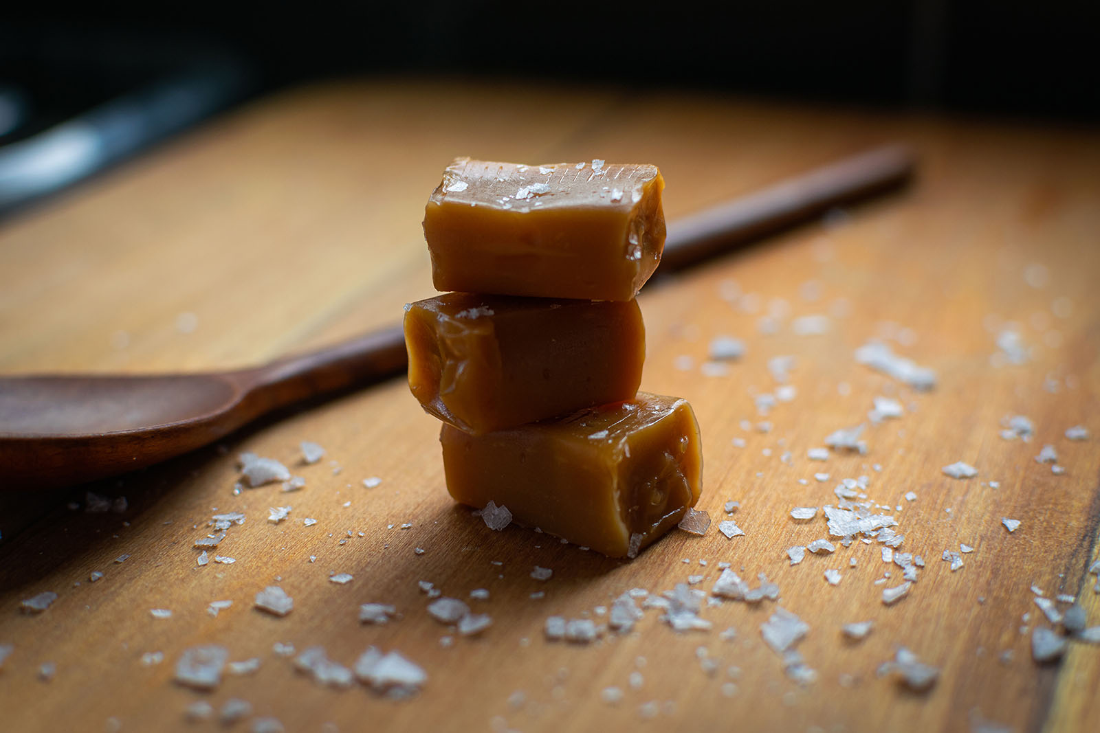
For this project I created a new logo and brand style guides as well as editing video footage for a mock advertisement. I also used photography skills to give the illusion of an expensive toffee when the product is in fact cheap.
Initial Exploration of Ideas.
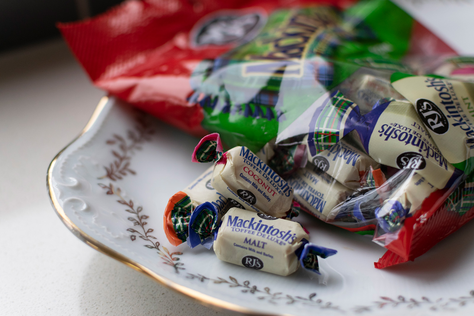
I first explored the existing branding for RJ’s Mackintosh Toffee products. The style was rustic and a little vintage with serif fonts and a logo that looks slightly playful. This gave the feeling of a friendly approachable and affordable toffee.
My initial ideas were to take the rustic style and spin it with a more fancy appearance. Something akin to Harney & Sons.
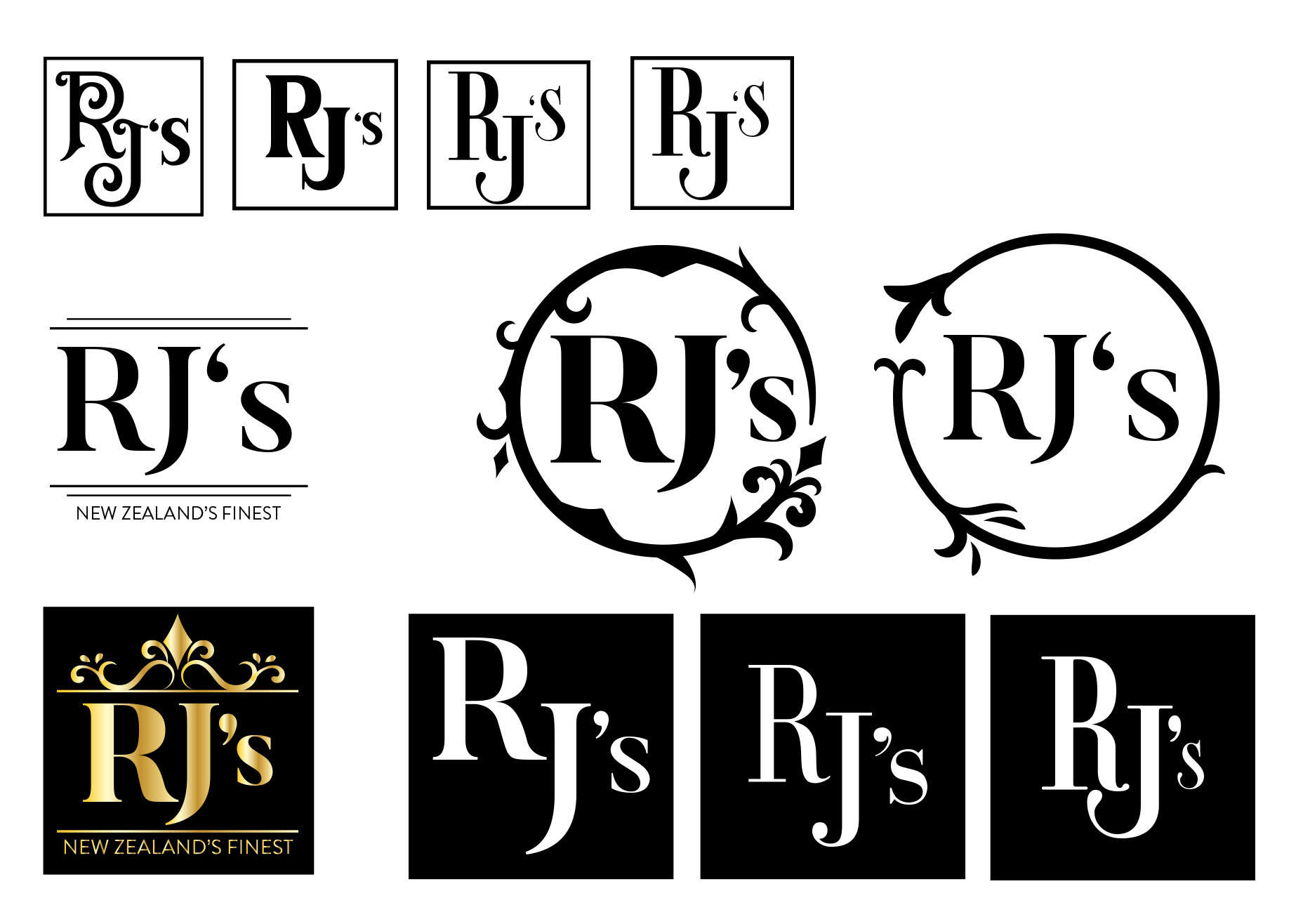
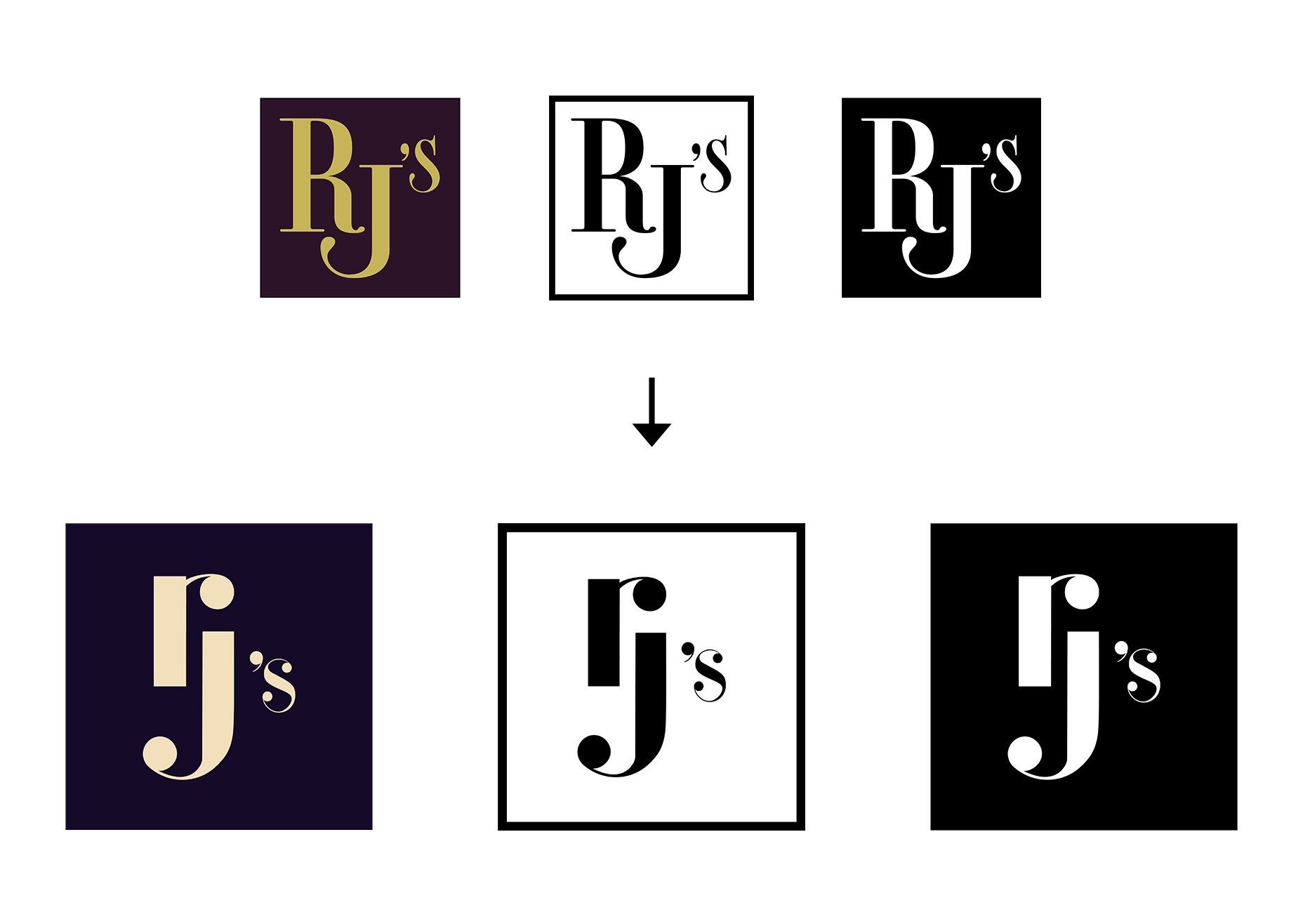
Exploring the logo design.
These were some of the initial work in progress concepts and ideas that I played around with. Initially going for the flourishes and Victorian inspired patterns.
However upon feedback I was told that I should try a more modern approach to luxury brands. Opting for a layout that is more simplistic in nature. This was because modern brands use the ‘less is more approach’ to luxury branding.
Trying too hard to capture a “fancy” feeling cheapens the aesthetic so I tried a more minimalistic approach.
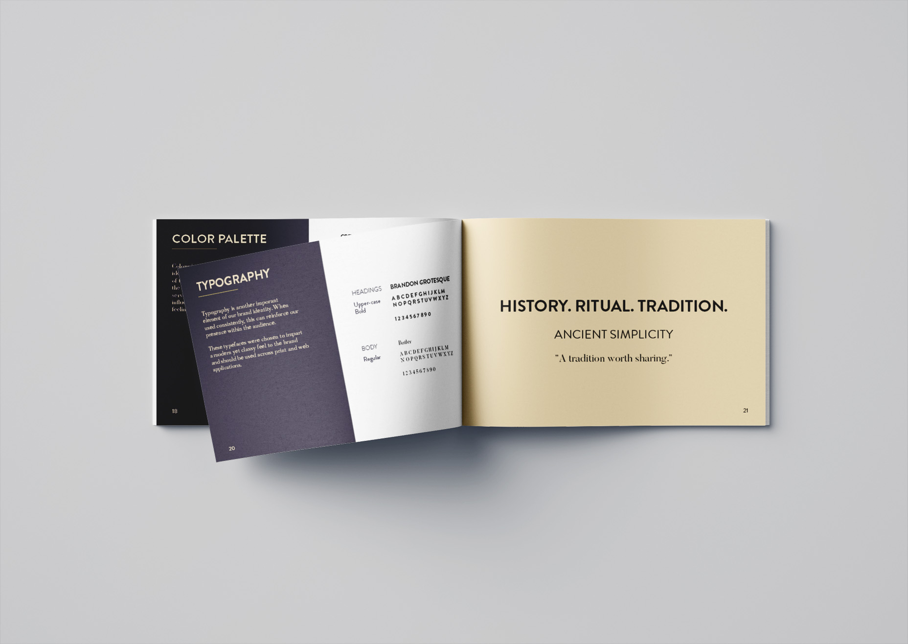
The final logo is a mixture of more modern minimalistic logos with the use of serif fonts creating a calmer and confident feel that isn’t trying to impress through bold displays but with a sense of subtlety.
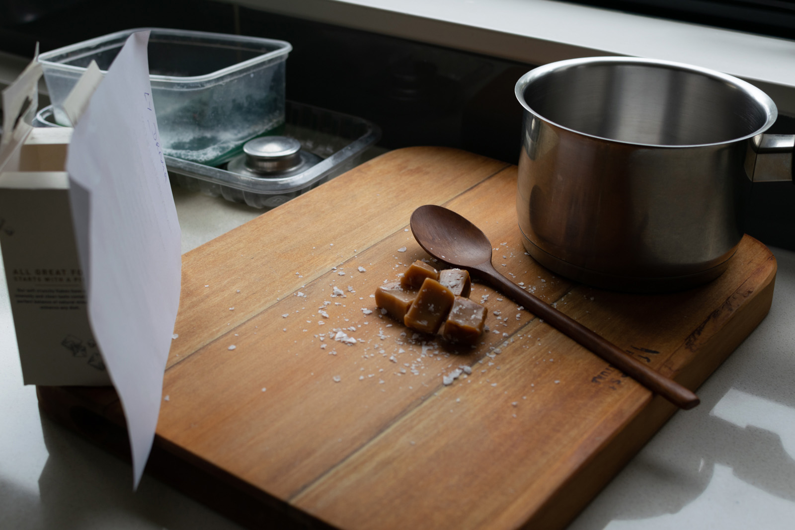
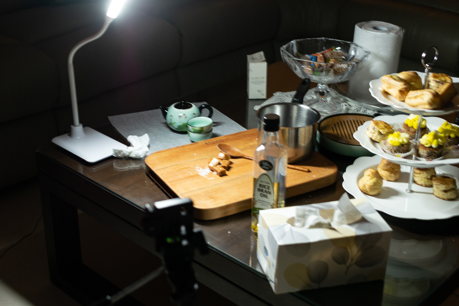
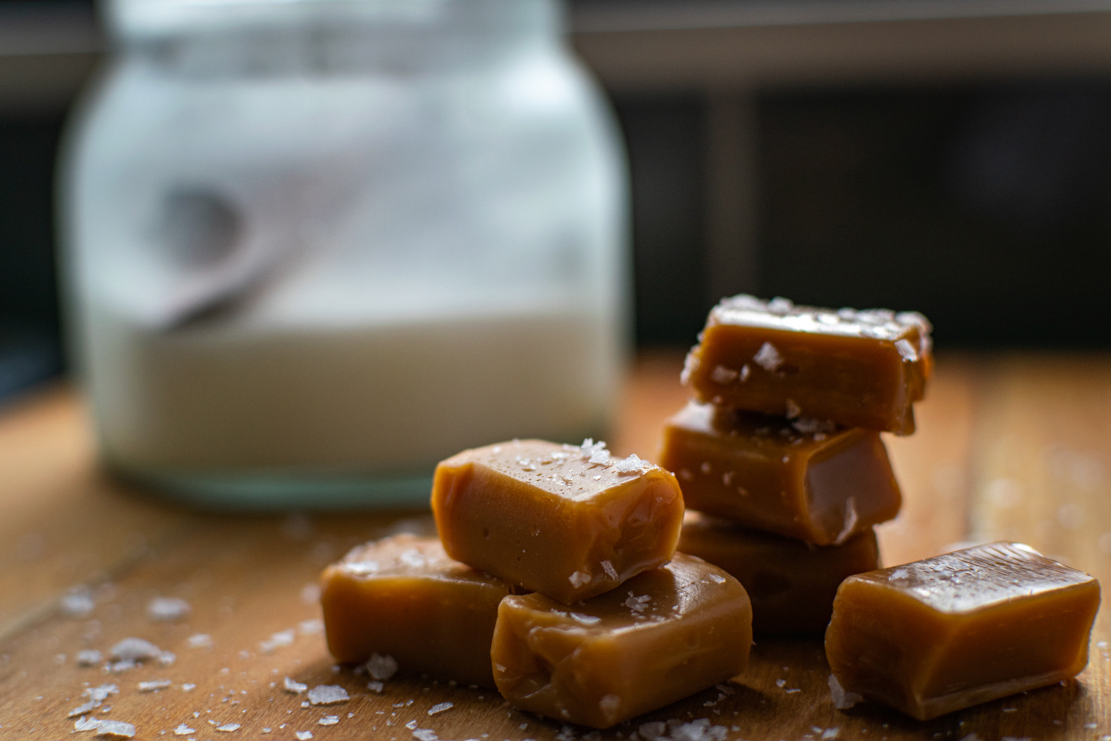
Photography and Video.
With the logo done, it was time to start creating imagery for the tone of the brand and its advertisements. Because the RJ’s Mackintosh Toffee is already an established brand I thought it would be a good idea to spin it with a rustic photographic feel.
Leveraging history pairs well with a luxury brand, giving the sense of a brand that has evolved and been refined over many years.
Photos were taken during lockdown at home with the tools I could found. I also recorded a short video as a concept for what the ads might look like.
Wrapping it up, kind of.
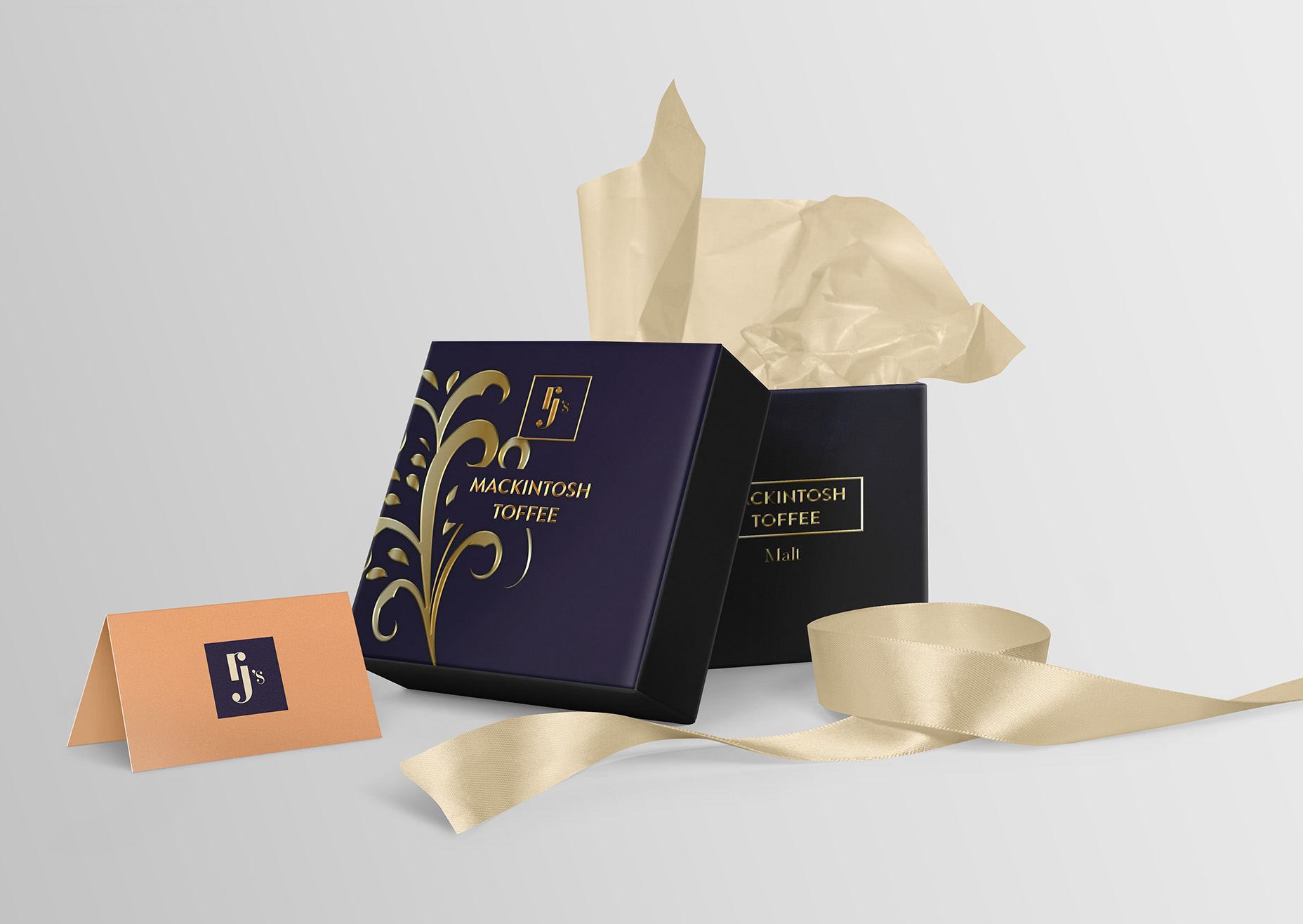
The final piece of the project was to collect all the branding and design styles into a booklet and print it in A5. A mockup of the proposed packaging design was also created.
For the packaging I went with materials that conveyed a sense of higher quality, something akin to containers which store rings and jewellery.
The interior would be a wax coated card to prevent sticking and the toffee would simply wrapped in paper. The outer design of the packaging would feature gold debossed letters and patterns and tied with a ribbon to hold the lid.